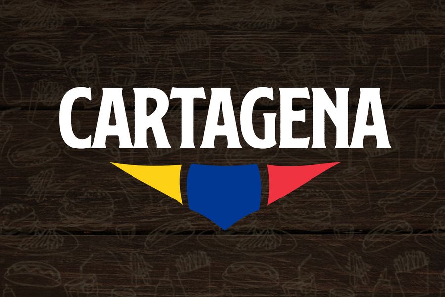
Cartagena
Problems brought by the people of Cartagena
- Shop needed all the branding done.
- They wanted to use the name of the Colombian city, Cartagena.
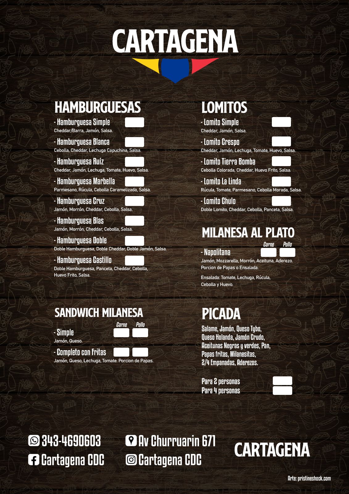
- They needed the menu and some boards for the shop.
How we solved these situations
- We used the flag colors in making the logo, combined with bold typography is enough to make the logo’s presence strong.
- We made the logo, the menu, small menus for social networks, a board to hang on the wall, a rubber stamp to put in the food boxes, and more.
- Argentine prices are on change month to month, so we offered a menu with and without current prices, making it easy for them to change it from time to time.
Cartagena Branding Highlights
- Appealing logo and very easy to showcase
- Menu with high readability
Conclusion
Cartagena was our first work on complete shop branding, making our work reach new forms we haven’t worked with before. We and also Cartagena owners are delighted with our work. You can contact us if you want to see a complete showcase of Cartagena’s work.
Share: